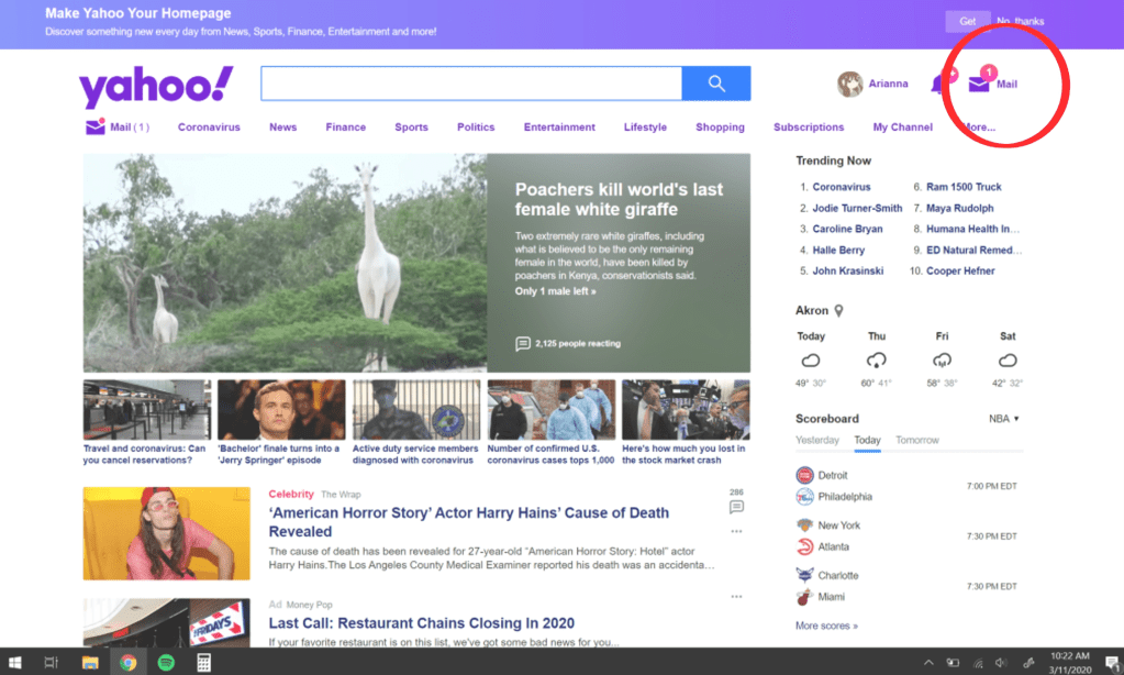
My negative design example comes from Yahoo. Whenever you open Yahoo to go look at you mail, they will put a notification number next to your mail (the little number that lets you know how many new emails you have) and it is always either completely off or downright deceitful. In this screenshot, Yahoo tells me that I have 1 new email to get me to check, and then once you do, you see that you actually have no new emails. This, in my experience, disturbs the functionality/credibility of the website. If I have to waste time checking fake notifications, then something isn’t right here.

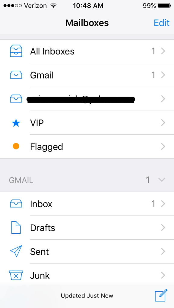
On the other side of mail related software, the mail app (apple) is great design! The way it’s set up is the thing that makes me happiest. You can connect multiple emails to your inbox and separate them by email or have them all in one inbox. I find this a very convenient design choice made by the developers. It helps me speed up my process of looking at my emails while also giving me the option of looking at each email’s inbox directly if I’d like. This is especially helpful for anyone who has multiple emails. The design qualities/features that this possesses is great organization/convenience for the user.