Welcome to my Web 1 blog! My name is Arianna Reich; obviously I’m the writer for this blog. To begin with, I’ll tell you a little about me. I’m a second year Graphic Design student at the University of Akron. I’m from Green, OH, and I commute to school daily. My hobbies include drawing, playing video games, watching YouTube, watching anime, and reading manga. I am excited to learn about web and devices this semester!
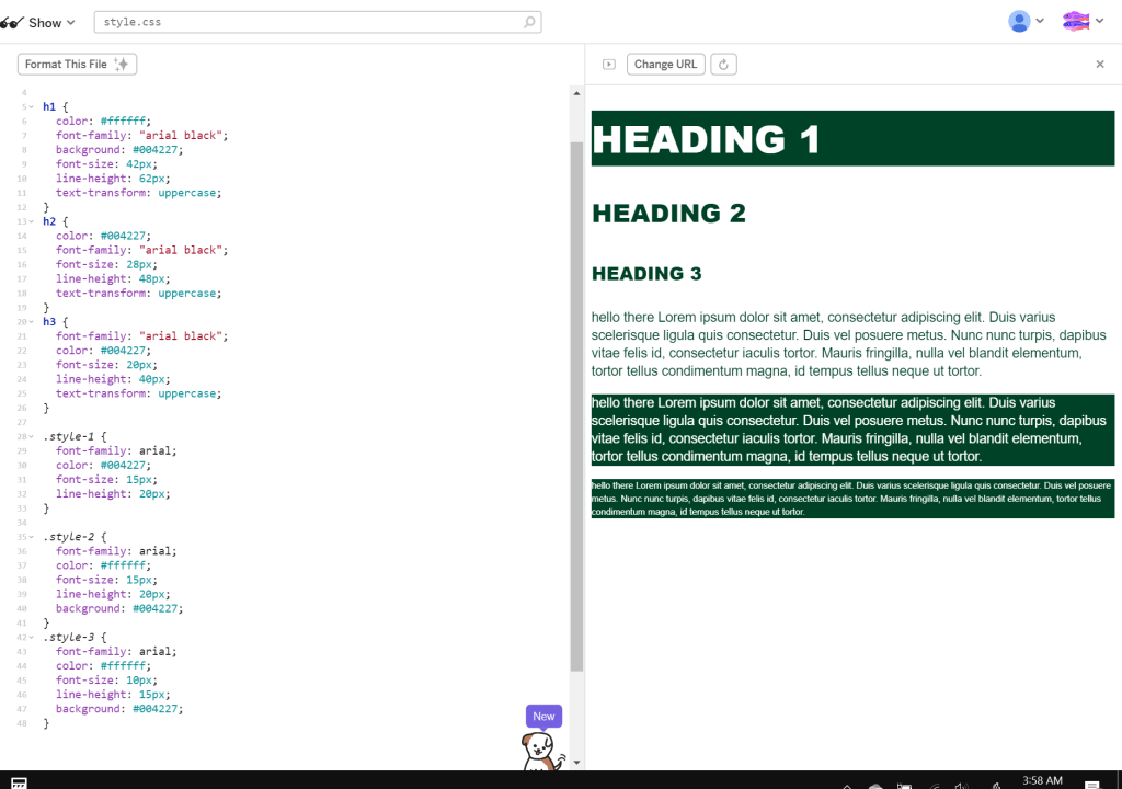
WEEK 13 – Type System
Here’s my type system!
WEEK 12 – Keywords
*READ ME: *This is late because I had no power *
This is a list of 7 keywords that will be used in the <head> meta tag for easy discovery.
- fast-food
- drive-in
- burgers
- fries
- restaurant
- food
- milkshakes
WEEK 11 – Comparable Research Sites
I want to do Skyway, which is a drive-in restaurant. I looked at similar places and their websites. (https://www.skywaydrive-in.com/)
- Swensons- Their menu is very engaging while also being very easy to follow; the navigation is also clean and easy: http://swensonsdriveins.com/swensons-menu/
- Sonic- Their menu is nicely segmented into sections for the types of food which you can click through. Their main page is simple and leaves the food as the focus: https://www.sonicdrivein.com/
- Burger King- I know it’s not a drive-in, but their main page is nice and understated with a static nav bar which I like. The menu is in a very odd spot though, which isn’t ideal, but I do like that it’s picture based: https://company.bk.com/menu
- Dairy Queen- Another fast food place, Dairy Queen has a nice short home page. I like that its quick and to the point, so you can go through the other pages to view the rest of the site’s information: https://www.dairyqueen.com/us-en/?localechange=1&
- Five Guys- Five Guys has a very simple menu, and I like how the main page is set up. In general, most of their pages are pretty simple, but it still goes with their brand/color theme: https://www.fiveguys.com/
- Freddy’s- Freddy’s has a nice website that goes along with it’s color theme without being too overwhelming. They have several images on their home screen that are all linking to pages in the nav; and though some of them give out some info; they all have their own individual pages (Skyway has one “page” that just links to the bottom of the home page): https://freddysusa.com/
- Pav’s- Pav’s keeps their website simple with a single hero image and the nav bar overlaying this image on the left. They also have their social media handles on the bottom of the screen instead of in the nav: https://pavscreamery.com/index.php
- Panera- Their front page is simple- still follows their theme- but isn’t overwhelming. Their header is understated and doesn’t take up like, half of the screen: https://www.panerabread.com/en-us/home.html
- Chipotle- I really like their header, and the idea of having a couple menu items on the front page is interesting: https://www.chipotle.com/
- Chick-fil-A- Their website is really light (sparing use of accent colors) and the menu is part of the main page (you just have to scroll down) However clicking on the items themselves takes you to a different page: https://www.chick-fil-a.com/
WEEK 9 – Positive/Negative Design Examples
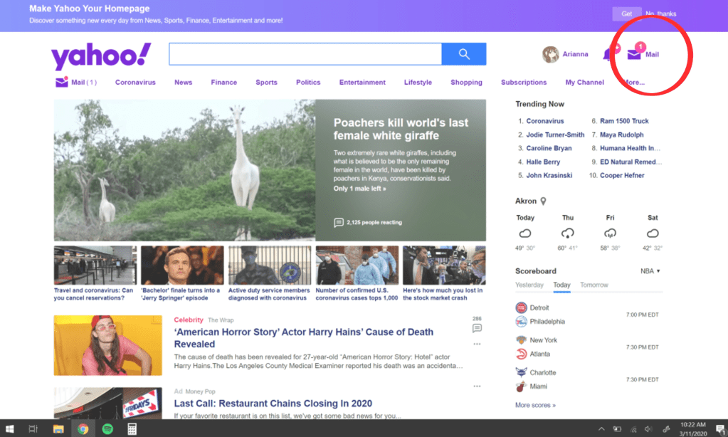
My negative design example comes from Yahoo. Whenever you open Yahoo to go look at you mail, they will put a notification number next to your mail (the little number that lets you know how many new emails you have) and it is always either completely off or downright deceitful. In this screenshot, Yahoo tells me that I have 1 new email to get me to check, and then once you do, you see that you actually have no new emails. This, in my experience, disturbs the functionality/credibility of the website. If I have to waste time checking fake notifications, then something isn’t right here.

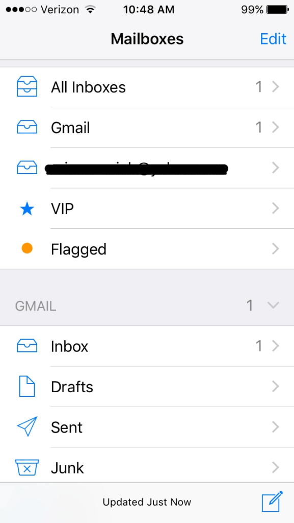
On the other side of mail related software, the mail app (apple) is great design! The way it’s set up is the thing that makes me happiest. You can connect multiple emails to your inbox and separate them by email or have them all in one inbox. I find this a very convenient design choice made by the developers. It helps me speed up my process of looking at my emails while also giving me the option of looking at each email’s inbox directly if I’d like. This is especially helpful for anyone who has multiple emails. The design qualities/features that this possesses is great organization/convenience for the user.
WEEK 8 – UX Design Pins
I added five different things to this board. The first is a website for a font someone created. I picked this because I think it’s a nice design example.
The next item is a link to a website with design/template ideas, which could be good for inspiration.
Item number three is a link to a list of portfolios. I really liked the minimalist look of Viggo Blomqvist’s portfolio in particular.
The next item (the one with the red-orange background) is just a cool website that I found that I really liked the design of.
The last item is a link to an article which details how to set up your own UX design portfolio. I chose this because I feel that it could be some potentially useful information.
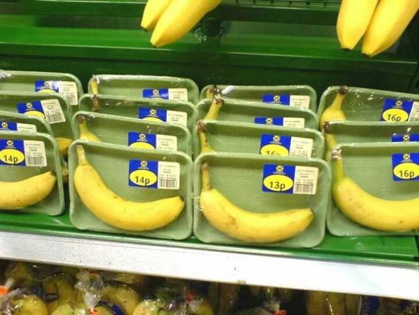
WEEK 7 – Poorly Designed Packaging
Something that you often forget about that can be quite annoying is packaging. We often like to joke about how chip bags these days are more air than chips, or how the plastic on scissors can be ironically impossible to open, but we’re all just so used to it that it just seems normal to us.
In my mind, there’s two types of this issue. The first type is with food packaging. Usually this entails a half-full bag of chips or a granola bar that’s smaller than you thought it would be. This is irritating because it makes it seem like you’re getting more than you actually are, because once you open the packaging, you can see that a good portion of it is just air. It’s also a huge waste of materials as well as wasteful when it comes to the environment.

The other type is packaging for non-perishable items. For example, this image of packaging for these “LOL Dolls” is crazy! So many items have such unnecessary packaging nowadays, and it creates a lot of waste, which is bad for the environment.
WEEK 6 – My Qualms with Reddit’s Web Design Layout
Reddit is generally a pretty good website when it comes to its layout. You can search for and select a sub-reddit up top, and then once selected, you can scroll through your chosen sub-reddit’s feed. From here, you can also click on posts to enlarge them to see more. This main layout is not the issue, however. My main problem with Reddit is how they integrate their ads. While some of their ads are on the sidebar–which is perfectly acceptable–a majority of their ads are integrated into the feed and formatted to look like regular posts. You can even upvote and comment on them. And while there are a few things that distinguish these ads from the regular posts, you generally don’t notice it too much when you’re scrolling through.
The main issue here is transparency with ads. Even websites that annoyingly cover their page with ads at least have the decency of just having them out in the open–they know they’re ads just as well as we do. When a website tries to hide ads in the content that you actually care about, it seems insincere from a viewer standpoint; like they are trying to trick us into looking at the ads that we would otherwise not read. And I’m not kidding–often times, I’ll get at least part of the way through reading some of these ads before I realize that it’s not an actual post! And in my mind, that is a bad web design!
Just for irony’s sake, I’ll link you to r/assholedesign on Reddit so you can see this firsthand.
WEEK 5 – Good/Bad Web Design
This week, I’m looking at good/bad examples of web design/layout.
Starting with good examples, let’s look at Anime Planet. I enjoy their website a lot in general because of the easy to use navigation tools. With it, it’s easy to find exactly what show or book you’re looking for and to set it aside in any category you want for later. Everything appears in a grid system when you search, so it’s easy to scan for what looks interesting. When you find something that looks good, you can hover over it to see a brief description of the show/book. Love it!
Anime Planet: https://www.anime-planet.com/
My second example of good layout is Bulbapedia. This website is basically Wikipedia but for Pokemon info. And while the home page might not seem like much, the search on this website and the other web pages are amazing. You can search for exactly what you need to see, and once you get to the web page for the item you are looking at, it will have absolutely everything you could need to know in easily distinguishable sections. Any other topic mentioned on the page is linked out to another page for easy access. In general, very easy/convenient to navigate; also very well organized.
Bulbapedia: https://bulbapedia.bulbagarden.net/wiki/Main_Page
For bad examples, we’ll first look at the website for The Cleveland Museum of Art. The general design of the website isn’t too bad, but the thing that gives me chills is the margins. Everything is so close to the edge of the page that it creates tension. I really feel uncomfortable looking at it! 😦
Cleveland Museum of Art: https://www.clevelandart.org/
Our second bad example is MY website! And to an extent, WordPress too. The thing I hate about my website is that you cannot access all of my posts from the main page. You can see the two newest posts, but the only way to access older posts is through clicking on a post and selecting “view previous post.” Now of course, I’m sure I could resolve this issue, but WordPress is somewhat at fault here, too, for being so dang confusing! A service for making websites for average people who can’t code should be easy to navigate and figure out and it’s just not!
WEEK 4 – Web Design Jobs Outlook through 2022
This week, I found an article discussing the outlook for web design jobs through 2022. It talks through ‘everything you need to know’ if you are looking to become a web designer between then and now.
In the article, it first discusses the things a web designer might be asked to do. They include things like developing web pages, creating the visual design of web pages, conducting user tests, managing social media and more. The article goes on to talk about necessary education for the job and while many web designers these days have at least an associates degree, you can get into the job even if your degree isn’t necessarily related. The article even mentions that getting a job in web design shouldn’t be difficult with a degree in graphic design; as long as you also have some knowledge of html and css. They also mention how writing for web design is currently in demand as well.
In general, the field of web design is growing as the need for everything to be digitized grows as well. The article estimates that the field of web design will have grown by 20% from 2012 to 2022. It is said to be one of the fasted growing fields based on “the growing popularity of mobile devices and eCommerce.”
Want to read the article for yourself? Visit it here:
WEEK 3 – Portfolio Web Design
So this week, I ended up making another website for myself! As I am starting to apply for internships for over the summer, I found that I was in need of a portfolio website, as such, I made one yesterday.
For my website, I used Wix. Personally, I’m not the biggest fan of WordPress because I find it can be overly complicated to set things up how you want them. I also heard from someone else that Wix was easy to use, so I though I’d try it out.
After setting a few things up, I ended up choosing a portfolio template for my website, an it was very easy to set up and customize. All I had to do was upload my images, write a few descriptions, and make an about page (I also customized the background and menus). The design of the template itself is one that I find myself really enjoying. The images all fit together in different sized boxes, so I don’t have to adjust any of the dimensions. All of the different sizes also give it nice visual interest! I also set it up so that you can click on the images to enlarge them and view the title/description.
Overall, what might seem like a difficult task ended up being pretty fun and satisfying to put together; and while WordPress might be nice for a blog, I definitely like Wix for my portfolio.
Here’s the link if you’d like to see it:
